

It’s easy to play by the rules when it comes to custom t-shirt design. There are conventional sets of colors that people would generally agree to go well together. But there are loads of less conventional (but equally cool) color options out there that are sure to make your t-shirts look refreshing and original.
In this blog, we explore some of the lesser used sections of the color spectrum to come up with 9 unique t-shirt and ink color combinations that actually work well together.
1. Olive & Gold

We’ve seen this color combo countless times on different olive oil containers, but not much on t-shirts. If there was any worry that these colors don't translate well though, the photo above should put that to rest.
This t-shirt design color combination somehow pulls off looking both muted and earthy while still adding some shine with the gold foil, making it distinct without being obnoxious.
2. Orange & Blue

Orange and blue are complimentary colors on the color wheel, which makes a lot of people think that they’re supposed to pair well together, but that isn’t necessarily true. It’d be more accurate to say that they provide balance to each other than to say they look great together.
That being said, pairing complementary colors together can often make for a loud, abrasive color ensemble –– particularly if you use the truest versions of the colors like a royal blue and bright orange. Trying to pair the colors together can get tricky.
If you tone down the versions of the colors you use though, they actually turn out to be quite nice. Using a navy blue and a more subtle orange can make your t-shirts look really nice without coming on too strong.
3. Forest Green & Light Pink

If you’re like us, you’ve probably never really thought of these colors in the same realm. Forest green being darker and earthier while pink is bright and playful. They provide an excellent contrast thought, and it just works.
Giving it more thought though, it makes total sense. If it’s good enough for pink flowers with green stems, it should be good enough to fit on a t-shirt.
4. Red & Yellow
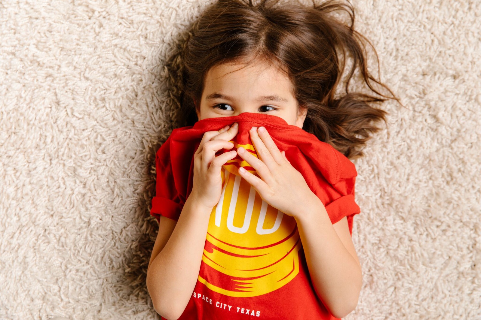
You might think that these colors are too close to each other on the color wheel to really work together –– or remind you too much of a certain superhero –– but don’t let those notions sway you against choosing this color combo.
Feel free to bump them down a shade, or keep them nice and bright. This color combo is bright, fun, and will be sure to stand out (in a good way).
5. Beige & Maroon

The pairing of beige and maroon is definitely not the flashiest color palette, but not everything needs to be flashy. These two colors don’t work for every design—they lend themselves toward more old school looking t-shirts (notice the portrait illustration in the photo above).
If you’re going for more of a modern look, stay clear as these colors are rich with tradition. But if you have an older-style illustration, or maybe a serif typeface, consider this option.
6. Red, Blue, & Yellow

Primary color overload! Normally, we wouldn’t recommend mixing all three primary colors together. Your t-shirt might end up looking more like an elementary school lesson on colors than it will a cool t-shirt design. But when done right, this color combo can work.
The key, much like with orange and blue, is using subtly different shades of one or two of the colors to make the contrast less harsh. The t-shirt in the photo above uses a navy blue and orange-ish red to pair with the more true yellow, and that’s what helps set it apart.
7. Black & Gray

There’s a common rule in the design world that grey and black and white don’t go well together. Well, we don’t buy it.
These two colors pair together really well on a t-shirt, creating a color combo that almost anyone will like to wear.
Interested in something with even less contrast? Check out our guide on Black-on-Black t-shirt printing.
8. Yellow & Off-White
Yellow and white don’t typically make the best pairing. Both colors are very bright, and if there’s text on the t-shirt, it ends up being really hard to read—so a lot of people rule out this color combo before ever trying it.
However, going to an off-white as opposed to a more traditional one can make this t-shirt color combination work. It’ll give your t-shirts somewhat of a retro vibe, and the off-white will make the whole thing much easier on the eyes.
9. Green & Green (...& Green)

“You can never have too much green.” Oh, you’ve never heard anyone say that? Yeah, neither have we, but we’re ready to start it. The sea turtle-centric design above does an awesome job of blending different shades of the color green to create a compelling design.
This method can work with any color, really. Using different shades of the same color in a design is an awesome way to add some intrigue to your design without throwing in too many colors.
Interested in "going green" in a less literal sense with your next custom apparel purchase? Learn more about our selection of eco-friendly custom t-shirts.
Wrapping Up
As much as people make of design and color theory, a lot of it is simply up to you, the designer. So feel free to bend the rules a little bit and use some of these less traditional color palettes in your next t-shirt design.
Ready to start designing? Be sure to download our free custom t-shirt design kit before you get started!


.svg)